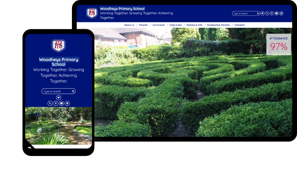
Why is Your School Website More Important Than Ever in 2022?

Published: April 28, 2022

For the longest time, websites for schools and educational institutions were more or less a place to put all the basic information about it. They were rarely a functional tool in the school’s arsenal that could help them much. 

With the rise of online teaching in the wake of the pandemic, websites are more important than ever in 2022.

Today, they are flexible, agile platforms that keep everyone from pupils to their parents in the loop and enhance the learning experience of students.

Let’s find out what wonders having a functioning website can do for your school.

Your school website — an essential marketing tool 

In the age of the internet, everything is online — people, businesses, offices — you name it. Your school website is often going to be the first contact people make with your school. Anyone who is interested in it would be going to the website to learn more about your school.

The website is an essential marketing tool to help you create a noteworthy first impression. You can immediately draw potential pupils and their parents by making enrollment easier. They can connect with you as well as learn more about you in detail.

As a website makes it easier to contact you, it directly impacts your admissions. It also helps in running the school and keeps existing students in the loop.

Benefits of having a school website 

Having a website for your school is a necessity now. It offers many, many benefits in the digital age. Here are some of the most prominent ones to consider:

Showcase your school online 

Websites are a virtually endless space to showcase your school’s accomplishments in a permanent way. Whatever your school has achieved — be it trophies or smiling students — it can be front and centre on your website.

It creates an immediate impact on the visitor. More importantly, It creates transparency about what a day in the life of your school looks like. You can connect with your community and show them what your school excels at.

Implement a long-term marketing shift

Many traditional schools are understandably intimidated by the idea of creating an online presence. Your website can be the first step in that direction. Social media, blogs, and newsletters can come after you get the hang of running the website.

In fact, your website is what every social media post and blog post would link back to. It helps in creating a seamless marketing shift to the online space.

Attract new students or prospective parents

Often being the first point of contact for potential students, websites play a huge role in attracting them to your school. They can see and understand what your school is like and if it is something they would like to be a part of. 

They can also research extensively and clear their doubts before they apply for enrollment, something that may not be that effective in physical settings. 

Allows open communication 

Users can find exactly what they are looking for on your website. You can initiate open, honest communication with them on topics of their interest. You may dedicate a page for forums where your community can interact in a transparent way with each other. 

Hire the right staff

Websites don’t just help you attract prospective students, they also help you hire better. People wanting to apply for various positions in your institution will get to know it through your website. It will give them. A glimpse of what working with you will be like. 

Way forward 

School websites are growing into a more functional role with the rise of online teaching. A practical website can not only be a showcase of what your school stands for, but also help in enhancing the learning experience of students as a whole. 

The way forward is to keep enhancing the websites to be helpful tools for the school, its pupils, and their parents. Focus on providing a comprehensive experience to the users and frequently updating the website to keep everyone in the loop. 

How to Improve the Structure of Your School Website Navigation

Published: March 31, 2022

Your school website is the primary source of information regarding everything for parents, students, and future employees.  As a web design company one of the most common things you are expected to hear when taking up a school website design project is that it should be ‘easy to navigate’. 

But the most common question here is how do we create a site that is ‘easy to navigate’? Let’s explore a few things you need to take care of when designing the navigation structure of your site. 


1. Keep the design simple

As a designer it’s totally fine to come up with unique designs that can pleasantly surprise the users. But it is always safe to play safe with the navigation structure. If the users take too long to figure out what to do next — for example, struggling to locate the search button or figure out the Submit button for the Donation program — chances are they will abandon your site never to return again. 

2. Restrict the number of choices

When users look at your site menu, they should be able to easily skim through all the options available on your site. If users are overwhelmed with too many options and they’re not able to make a choice, their only option would be to leave your site. Hence it is recommended that you stick to eight or fewer menu options when designing your site. In case you have a number of buttons available, restrict yourself to include only three or four buttons. If the other departments force their choice on including every single detail on the header, take a firm stand. 

3. Limit the number of clicks 

When designing the site navigation, make sure to use dropdown menus under the main navigation menu. This will help the users to directly navigate to the page of their choice. The best part is that the users will also be able to navigate to a section that may be nested deep within without clicking on every single page. Another popular way of organizing the navigation structure of your site is by using a hamburger or navicon menu on the desktop that emphasizes the key items on the site. With this design structure, users find it easier to locate the deeply nested pages by simply hovering over the main page menu. 

4. Be consistent 

Your visitors, especially ones with disabilities, expect your site to be predictable. If the navigation is consistent across the site, it makes it easier for everyone to locate specific items within the navigation structure. When designing the navigation structure of your site, make sure you use menus and other navigation mechanisms that are consistent across all the pages. With items that are repeated in the same relative order ensure that you place the menus in the same place on every page. 

5. Ensure mobile accessibility

While designing the site, you need to make sure users are able to access all the pages, including the deeply nested ones, as easily on their mobile phones as their desktops. The most important aspect of working on a mobile-friendly navigation is to work with a company that understands the mobile-first design. This is important as the designer needs to take the different device experiences into consideration while working on the layout and navigation. 

6. Offer guidance to the users 

To make your site navigation successful, make sure you offer enough guidance by including featured links that you would like the users to visit. Including clear call-to-action instructions throughout the site works really well when you want users to take any predefined action, such as submitting a form or clicking a link to explore more.

To sum up 

Understandably, the requirements for each school are different. There are additional considerations that need to be taken care of by the design team while deciding on the navigation structure of the school website. We believe that following the guidelines mentioned above will be a great starting point for you. 

Best School Website Designs of 2021

Published: February 14, 2022

School websites have transitioned from being luxury to a necessity. Today all schools need a good, functional website to reach out to more students and parents. At School Jotter, we continue helping schools with amazing website designs among other things.

Today we have collated some of the best school websites, as rated by our team members. We hope the list will help other schools with website ideas and inspirations. Without wasting more time, let’s see which schools have made it to the list.

Copley Junior School

Copley Junior School

Copley Junior School’s website uses a simple yet vibrant design that brings out the essence the school wants to convey. The text and images chosen are bright and bold, which highlights the playful nature of the school. Using the school google across the page is a fresh move that brings out the beauty of the web design.

However, it is important to note that Copley Junior School does not try to pull something daring with its website. It is a simple and functional website that gets the job done. The home screen has links to all resources that parents and students can need.

According to our Delivery Team Leader Charlotte, this is our best school website design of 2021. 

Christ Church C of E Primary School


Christ Church C of E Primary School

Christ Church C of E Primary School has done a great job with their school website with the use of bright and bold colours. It is more of a minimalistic website with few images and more text. However, the text is big and bold which makes the webpage look vibrant. 

The events section is very legible and understandable, making it one of the best sections of the webpage. It is a clean and simple school website that gets the job done.

Sam, our Education Manager, thinks that this is our best school website design in 2021. 

Holy Trinity Primary School


Holy Trinity Primary School

The school website of Holy Trinity Primary School is one of the cleanest and most legible school websites we have seen in 2021. The most notable component of the website design is colour coordination. The pictures complement the background and foreground colours very well. It has a clean and organised menu that answers all possible queries parents and students can have. The events and news sections on the main page make the website even better.

Our Delivery Support Technician Liam M feels that this is our best school website design of 2021. 

Bishop’s Waltham Junior School


Bishop’s Waltham Junior School

If you want to see a great example of a neat and tidy school website, check out the  Bishop’s Waltham Junior School’s website. It does not go crazy with colours or designs and keeps things nice and neat. 

A notable feature of this website is the use of interactive YouTube links. By bringing these small factors into their websites, schools create a much better experience for visitors who want to know more about the school. On top of that, the bulletin space enhances the appearance of the entire main page.

Liam J, our Account Manager, nominates this website as our best school website in 2021. 

Cullingworth Village Primary School


Cullingworth Village Primary School

Using the Lynx theme has been a gamechanger for the school website of Cullingworth Village Primary School. The website uses a red colour scheme which looks very attractive. Apart from that, the choice of fonts makes it ideal for kids and their parents. There are a bunch of photos of kids which add to the charm of the website.

Our Head of Service Delivery and Support Arthur also has his kids’ pictures on the school website. He feels that this is our best school website he has seen in 2021. 

Upper Batley High School


Upper Batley High School

If anything defines a modern and sleek website, Upper Batley High School’s website does. It uses a neat colour scheme focusing on blue and white. While the design is minimalist, it does not leave out any important information. The menu is easy to use, and there are many pictures that highlight what life in the school is like. All accomplishments of the school are visible neatly at the bottom of the main page. It is undoubtedly one of the most attractive school websites of 2021.

Our Account Manager Lawrence feels that this is our best school website in 2021.

Conclusion

School websites are very important for any educational institution that wants to be more accessible to parents and students. However, some school websites fail to live up to mark. Either they clutter it with too much information or miss out on crucial resources.

From an educational perspective, school websites have a distinct purpose. All the schools we mentioned tick the boxes that our experts look for.

SEO For School Websites — Is It Important?

Published: February 7, 2022

If you manage a school website, by now you will be aware of the importance of Search Engine Optimization (SEO).  SEO not only helps to improve the quantity of traffic to your school website but also the quality of your website.  People however seem to have a common misconception that school websites do not require SEO and it is more relevant for other institutions and organisations. However, if you look at the search data, you would easily disapprove of this fact. 

With 3.5 billion searches made everyday, it can be safely concluded that these search trends should not be ignored. But the question is — is it possible to constantly keep up with these search trends and frequently update your website? 

The simple answer is yes, if you intend not to hurt your organic traffic.  Search trends help you understand and deliver the most effective and user-friendly content for each of your queries. A robust SEO optimisation strategy takes time to show results and when it does, you will be able to reap its benefits for years to come. 

1. Utilise location-based search strategy

Google My Business (the listing on Google search that shows your location and contact details) was created with the intention of helping customers engage on Google for free. The primary objective was to help small and medium-scale businesses connect with their potential customers across Google Searches and Maps. 

For most schools, the common statement is, “Everyone knows my school, why do I need this?”

But the fact is optimising Google My Business shows your school name up on the search even when a user doesn’t know you exist. 

For example, a parent who is new in the area where your school is situated, might simply key in the phrase, ‘best high school + location in the search engine. For that parent to find your school, you need to be on the Page 1 search results. And we very well know from historical data that very few people visit the second page. Having an up-to-date Google My Business listing can assist with this.

Another significant point to be noted here — Google detects the searchers’ location from the IP address. Even if you don’t include your region in the search, it will automatically deliver them local results including Google My Business listings… 

2. Comprehend the search intent for educational institutions 

Most search engine users these days are impatient. If they want their search to include specific results, they will use the related long-tail keywords. Now the real challenge is understanding those keywords and search terms so you can optimise your school website accordingly. 

In other words, the more content you have on your website that is related to the search term, the better are your site’s chances of ranking higher in the search results. 

3. Optimise for different regions 

It’s not just enough that your GMB account and site pages include only results for the physical location where you are situated. 

Some parents who have not entered your location in their search will not be able to find your school and they may not even be aware that you are already pulling students from their areas. This holds true for most schools that are located outside main cities and towns. 

What you need here is a regional landing page strategy. 

The most common approach to creating regional landing pages are highlighted below: 

  • Define the targeted area

You need to start by defining the area that you are targeting whether it is a specific region, city, county, etc. Then mention the key landmarks or work a bit into the history of the region. 

  • Geo-specific keywords 

This is in fact the most important point to consider when you are creating a location-based landing page that will specifically give you the local hits you need from your local population. The formula is quite simple — mention [type of school] in [region or location] or [location] in the content you have on your website. 

For example, 

  • Consistency 

Irrespective of whether you are creating one landing page or 10, the look and feel as well the style and tone of each page should be consistent. If you are a larger institution, it’s a good idea to come up with a style guide with specific branding colours and guidelines. 

4. On-page optimisation 

This is the process of doing everything on your website that could help to instruct Google to deliver you to page one. You should take on-page quite seriously if you want the search engines to reward you with the first page visibility. 

Let’s take a look at some of the best practises you may want to follow in your quest to rank on the first page:

  • URLs: Google has very clearly stated that URLs help them understand what the page is all about. In order to optimise the URLs: 
    • Include the primary keyword in the URL
    • Place the keyword to the left side of the URL
    • Keep the words that define the URL as real as possible
    • Keep the text simple and sweet
    • Use hyphens between two words 
  • Meta titles and descriptions:  Page titles are one of the most important on-page SEO factors. Both the meta title and description are important for the search engines to understand the purpose of the page. 
  • Header tags: These tags serve an important function for the SEO of your page. They have a direct impact on your page by:
    • Making it easier and more enjoyable for your users to read the page
    • Providing keyword-rich context to the search engines for your content
  • SEO writing: This typically implies that the content is written in a way that it is loved by both humans and the search engines. 
  • Keyword cannibalisation: Targeting many pages for a specific keyword can cause keyword cannibalisation and that could have potentially disastrous results for your SEO efforts. If you have multiple pages on your website ranking for the same keyword, you’re actually competing with yourself and that’s not a good on-page strategy to follow. 
  • Content audit: This is a vital mistake made by most content authors and editors. They keep on creating new content, but never bother to revisit or update their existing content. It’s absolutely essential to do content audits on a regular basis. 
  1. Mobile page loading speed 

In the real world, speed kills but it is not the same in the digital world. If your page doesn’t load fast on your mobile, the internet will kill your rank. 

Waiting for a page to load in its own sweet time is a frustrating experience. There are quite a few ways to reverse this experience:

  • Utilise the wide range of free marketing tools available to make quick fixes to your content. There are a few tools that can compress images to a fraction of their size. 
  • Limit the amount of media you include in your posts and pages. To ensure optimal page load speed, you should maintain a ratio of 75:25 for text to images. 
  • Make sure you have a prominent call to action (CTA) and the size of the CTA button should be at least a bit larger than your thumb. 

Final thoughts

SEO like anything else requires the right amount of knowledge, skills, patience, and consistency to produce the desired results. The opportunities are unlimited and as the search engine volumes grow, it will become more important than ever to keep working on your SEO efforts.

3 Reasons to Consider Professional Photography for Your School Website

Published: October 19, 2021

Since the pandemic, visits to schools for prospective families have been minimized.  These might continue again in the future, but there may still be many people who are wary of visiting lots of schools in their local area.

Rather than visiting schools, families are now deciding on the potential school for their child: predominantly online. It’s no surprise that your website has to do the heavy lifting when it comes to communicating the value of your school.

Photographs and videography are the first impressions a school can make on its potential suitability for families and students.  

Visuals are hard-wired into our brains as humans. People are 55% more likely to remember information when it is paired with the related image. Research shows we process images 60,000 times faster than text. What do you think of first when I say “Tesla”, not its features but the car itself (or in the same cases, I made you remember Elon Musk!)

If you want to make a strong first impression and create a deeper emotional impact; hiring a professional photographer is a necessity. 

You have to accept the fact that your school is a brand which attracts the right families. Photography and videography can assist in getting your message out to them!

We spend a lot of money creating quality education for students, meet-ups, and professional training for teachers and mentors. Why do we overlook to showcase the value we contribute to the lives of our students?

Here are three important reasons to quit wasting your time and opt for professional photography and videography right away!


  1. Photography showcases authenticity

We know the Friday drawing classes are for creativity and fun. And, students love each bit of it. A trained photographer, like a trained teacher, will do their best to get that message across. They will help you capture the natural spirit of the school and facilities. Moreover, a photographer who is used to working with kids, has the right skills to make them feel comfortable and at ease.

It’s a great way to show prospective families how much students and teachers love their time together. Instead of telling them in three long paragraphs about the quality of life you provide for your students, it would be more effective if they could see it in a one-minute video!


  1. It easily demonstrate your values

Photographs and videos not only “showcase” the activities students and teachers are doing, but they will also demonstrate how happy students “feel” while doing those activities.

It will help you capture their excitement, as well as the bond they have with their teachers or classmates. This simple image will demonstrate the ambience of your school!

Pro-tip: Most photographers avoid shooting on special occasions. Doing a shoot on teacher’s day, for example, would not be the best choice. Since it will not help them capture students their true selves.


  1. Photographs will help you tell the story of your school

When you think about your own school, What is the first thing you remember? The classroom, the building right? Because places hold history.

Every school and campus is different and has a unique story to tell. Whether your school has that one wall painted in blue or its culture is centered around history or modern art. What makes it stand out?

Photography and videography will evoke the personality of the school. This a low key method of demonstrating how the faculty and students are part of this unique environment. It will always remain part of their personal history. 

Pro-Tip (part 2): Photographs are not only a vital aspect of your website, but they also play a role in your branding. Documents, newsletters, invitations, and school events should all have the same brand consistency.


We’ve learned the value of professional photography. Now, the next step is to find the right photographer for the job.

And, let’s be honest, this could be quite a bit of a task. Finding a talented photographer that can accurately capture the soul of your institution, meet your deadlines, and stay inside your budget is no easy task! 

You can go through 1000 portfolios and spend your valuable time figuring out the right photographer. Or you can ask our experts at School Jotter!

Being an educational organization and having designed and delivered over 6,500 school websites to our customers, we are committed to find the best fit for your school.

Reach out to us today for your school’s brighter future tomorrow!

10 Design Mistakes to Avoid on Your School’s Website

Published: October 1, 2021

Did you know it takes about 0.05 seconds for a user to determine whether they choose to stay on, or leave your website? You heard it right! 

Though it’s a common saying, “do not judge a book by its cover”, when it comes to your website design, it is almost always subjected to an extreme level of snap judgment that may influence any perceptions of credibility.

If you are new to website design or are unsure about what will make an impact and help to increase parental engagement for your school’s website, here are some basic design mistakes that you should avoid.


1. Using stock photos

Photography is one of the most critical elements of good school website design. Using stock photos or bad quality images can dramatically impact the value associated with your school website. If you intend to use stock photos at all, then make sure they are of high quality and realistically express the emotions you have in mind.

2. Too many menu items

Researchers have concluded that when too many menus or options are given to users, the human mind tends to get confused and is not able to take the required action. Not something you want to happen with your school website.

For example, if your website has too many menus on multiple parts of your web page or multiple dropdowns under each heading, it is less likely that your user, in this case, the students or parents, will find the information they need. In such cases, the user will quickly skim through the menus or sections and will immediately leave the page if they cannot locate the appropriate information.

Related to menu items, there is another design mistake that often needs the designer’s attention — invisible navigation menus. If the visual cues are missing from the breadcrumbs, your user may struggle to find where exactly they are on the website or where they want to go next.  


3. Long pages

A school website serves many audiences — alumni, teachers, current parents, students, and prospective parents. The competing needs of the different types of audience compel many schools to overload their website with too much information that often extends to several pages and needs to be scrolled to access the complete information. This often leads to the parents missing out on critical information and causing a lot of confusion.

When building pages on your website, you need to use the most relevant and important information that must be conveyed and offer an option to either download a PDF for more information or contact the school to have queries resolved.


4. Keeping old / no longer relevant content

Continuing from the above point, keeping content that could be archived is one critical mistake website admins often make.  Content should be focused primarily on the current requirements of the target audience. Other information, for example, news and updates dating back several years, doesn’t hold relevance for current parents and should be removed and updated from time to time. 


5. Not being mobile responsive

According to Statista, until January 2021, the total number of active mobile internet users in the UK was approximately 65.32 million.

The most common mistake made by many designers is that they design a school website keeping in mind only the desktop version and bringing in the mobile version as an afterthought. Clearly, if you do not design a website keeping the mobile view in mind, you’re definitely ignoring a major portion of the audience and site traffic.

Instead, you should evenly weigh your desktop and mobile view considerations from the start of the project, this will definitely improve the user experience on your school website. Even the new mobile-friendly algorithm from Google provides an additional boost in your website rankings if it is mobile-friendly.


6. An old design

School website design has moved on a lot in the last few years. Ordinary home pages are oh-so-boring and outdated. Some designers also make the mistake of working on the design and the website copy separately. Designing the website first or creating the copy? This is kind of that world’s chicken and egg kind of question — who came first?

When looking for a design, make sure you choose something that stays relevant to the times and choose a theme template that has a modern look and feel. Making the site effective is more important than just focusing on the beauty aspect of the site. Text-heavy pages are a big no-no and over usage of graphics isn’t recommended either.

Another advantage of modern themes is that they also come with user-friendly navigation which helps both the parents and students to easily access information without worrying about what to click next.


7. Image resolutions too high or too low

Photos or images are an integral part of the website design process but if the image resolution is too high or too low, that can have an opposite impact on the user experience. 

When uploading images to your site, you should always look at the pixel dimensions. For a horizontal image, you should use at least 1024 pixels and the standard resolution for web images, also known as screen resolution, should be 72PPI. 


8. Too many images in slideshows

You might have seen many websites that have attractive images as slide shows or carousels, they might look really appealing, but they can detract from the crucial information you want your website users to find.

The Usability Guru, Jakob Nielsen, performed a test on a couple of users where he asked them to spot a particular deal on washing machines which was mentioned in one of the most prominent slides on a site – due to the number of slideshow images, most of the users missed that information. Thereafter, he concluded that image carousels get ignored. Notre Dame also performed a similar test and the result got them 1% action only on the first slide.

Even in the case of school websites, parents or students really do not have sufficient time to scroll through hundreds of images to find one specific piece of information. 


9. Avoid bright or hard to read colors for text

As rightly said by Tim Berners-Lee, the inventor of the Web, “The power of the Web is in its universality. Access by everyone regardless of disability is an essential aspect.”

Some of the most common accessibility mistakes that you can make when choosing a website design include background and font colour combinations, not providing a visual focus on certain elements on the website, missing alt text on images, or including link text that does not provide sufficient detail.

When you choose your next website design, pick a company that has incorporated web accessibility in its platform.


10. Overuse of scrolling text and animations

When the question of adding animations to website design comes, contemporary users like you might instantly like the idea of seeing some movement on the website and hence adding animations. Now if the animations are user-triggered then it does a good job in bringing in the desired impact. But using too many animations or movements could negatively impact the functionality of the website by slowing it down, and especially so when you open it on your mobile devices.

Again, additional and unintentional horizontal scrollbars that often pop up in otherwise responsive websites can also ruin the look and feel of the website and can slow it down tremendously.


Final thoughts

While designing a school website, it is critical to always keep your target audience and brand image in mind in every step of the design process. If you can reconcile the two, you will have a beautiful product that will be loved by all.

Designing a school website or any other educational software undoubtedly requires thorough expertise and relevant experience and with School Jotter guiding you every step of the way, you can get your website or app up in no time. Contact us right away to discuss how we can help you bring your vision to life.

Why you need a mobile-friendly school website

Published: June 21, 2021

Ensuring your school’s website is mobile-friendly is more important than ever for the new academic year.  But what does that actually mean, why does it matter and how can you get it for your school?

What is a mobile-friendly website?

Making your site-mobile friendly simply means ensuring that your existing website will shrink down when it’s viewed on a mobile-device, e.g. a smartphone or tablet. All important information, contact info, key pages, images and even videos or animations, should be easily readable in this smaller format, and your design should translate well to mobile too.

Why is a mobile-friendly website important for schools?

More searches on mobile:

With searches on mobile devices having overtaken desktop for many years now, you want to make sure that all-important information about your school, whether for existing parents, or potential new families, is all available with ease.

Visibility on search engines:

For the last few years Google’s search algorithms have given great prominence to sites which are mobile-friendly, so a mobile-friendly web design could mean you appear higher in search results. This could be particularly important at this time of year, as parents are potentially looking for schools to send their children to. 

How can I check if my school’s website is mobile-friendly?

Google’s own Mobile-Friendly Test is the quickest and easiest way to see if Google considers your web design to be suitable for mobile users. You simply enter your web address, and within a few moments Google will run a test on your site and present you with your results. Your website will be determined to be mobile-friendly (or not) and you will be given additional resources and information to learn more about the subject.

In addition to this it’s also worth taking a look at the website yourself on your own device, and consider, can you see and read all of your important information clearly.

What if my school failed the mobile-friendly test?

At this stage it’s important for you to speak to your website developers. If you haven’t had a new design for several years, then you should seriously consider investing in one to help make it easier for parents to see all the good things your school does.

Depending on the complexity of the design you want, a new website can take anywhere from just a few days, to several months to complete, but moving forwards, you should have a website that is much more accessible for more people.

If you’d like to find out more about a mobile-friendly website for your school

Our team of experts would be happy to help.  Contact us and a member of our team will call you back.

Why Upgrade to School Jotter 3?

Published: February 17, 2021

If you’re a customer of School Jotter, you will have heard lots already about School Jotter 3 and many of the improvements that we’ve made from our previous website platform. But for those of you who are new to us, we wanted to tell you a little more.

The history of School Jotter

Since its original release in 2008, and with the School Jotter 2 upgrade in 2012, School Jotter has undoubtedly been one of the most popular school website platforms in the UK, with over 6,500 designed and delivered using this software.
But as always technology moves on, as do customer requirements, so we’ve rewritten the School Jotter software from scratch and in 2021 are bringing you school Jotter 3.

What’s new about School Jotter 3?

We’re confident that School Jotter will give schools a more delightful user experience when it comes to controlling and managing their websites. But School Jotter 3 is not just a website content management system, it also offers mobile apps for iOS and Android, which we’ll talk more about in our next post.
We’re proud of the research and development that has gone into the brand new School Jotter 3, we’ve really focussed on re-writing the software and designing a new architecture, taking into account much of the feedback we’ve received from customers over the years.

How different is School Jotter 3 from the previous versions?

School Jotter 3 has been written from the ground up using the latest technologies, with a focus on speed, security, and usability. By focussing on key areas such as page layout management and easy onboarding of users to the web and mobile platforms School Jotter 3 makes life easier for school administrators and teachers.
With the innovative technological approach with School Jotter 3, Webanywhere has planned a roadmap of features which will consistently deliver added value and useful functionality to schools; both to users of the web platform and the iOS and Android apps.

Still unsure about upgrading?

We think there are lots of compelling reasons to upgrade to School Jotter 3, but don’t just take our word for it.  Here are just a few stories of customers who are moving onto School Jotter 3, and why they’ve taken the decision to upgrade.
Simone Peters the Managing Director at Monarch Childcare recently chose to upgrade to School Jotter 3 to make use of the new visual editor. The nursery wanted to enhance their brand and engage better with parents, so alongside the website, they decided to purchase the premium mobile app too. This lets them benefit from the new features such as contact forms and booking management together with instant messaging. Simone saw this as having a competitive advantage over other nurseries in the area in a bid to appeal to new and existing parents who have children enrolled in her nursery.
Gail at Albany Village contacted us when she heard about School Jotter 3, she could see straight away from the short videos how the CMS had been simplified and was much slicker to use. Despite being in contract still for a number of months they have decided to upgrade early and get in the queue for the upgrade and subsequent new design. 
A member of staff at an Infant School in Buckinghamshire had inherited the responsibility of updating the school website from a predecessor. Although she could update it, she found it very cumbersome to upload anything, and found the page layouts so limiting that she decided to stop even trying to change them. 
Karen advised us she would be looking into alternatives as all she knew of Webanywhere was the 9 year old School Jotter 2 software. We presented the new updated version of the software, displaying how flexible editing the page layouts had become and how easy the photos were to upload. Added to that the update came with a brand new theme, Lynx Deluxe was here favourite. 
Martin Allen Deputy Headteacher and all round good sport, took the reins of the website and works alongside the admin staff in updating content. They struggled managing the file manager on School Jotter 2 and the structure of the information and wanted an easy and more efficient and effective way of updating this. School Jotter 3 seems to be the answer for Rawdon Littlemoors, issues and they are looking at the deluxes theme and in particular the Leopard theme which is responsive and fantastic on mobile. School Jotter 3 instant mobile was a game changer and may move them onto the platform. The school have been a loyal customer for many years and hopefully for many more years to come!

Find out more about School Jotter 3

Over the next few weeks, we’ll be sharing lots more updates about School Jotter 3, but in the meantime, if you’re interested in finding out more about School Jotter 3 we’d love to have a chat with you. Book an appointment direct with a member of our sales team here, or get in touch with us at info@schooljotter.com

Best School Websites of 2020

Published: May 26, 2020

School websites have become a vital communication tool during the covid-19 pandemic. Despite the inevitable disruption, the team here at School Jotter is available for new sales queries and to offer advice and support to our current schools. Contact us using all the usual channels – details here.

Many schools have been using this time to update their websites. For some, it’s been a simple case of ensuring information is up to date, while other schools have chosen to give their website a complete overhaul or even rebuilt from scratch to provide a brand new portal providing information and resources to parents, children and other visitors. 

Summer is often the time when schools open their doors to potential new students and their families, but opportunities to visit in person are going to be limited this year. A good website can showcase your school and provide insight into its culture and ethos, making it easier for parents and children to make the best choice possible. 

We’ve put together a list of some of our favourite School Jotter websites from 2020. Have a look at the sites below – perhaps they will give you some inspiration for your own website!

Some of the best primary school websites in the UK include: Lindley Junior School, All Saints Church of England Primary School, West Acton Primary School, Woodlea Primary School and many more.

Lindley Junior School – 

www.lindleyjun.org.uk/
It’s easy to see why this school’s website made the list! The animated logo is welcoming, and the amazing drone footage immediately draws you in and gives you a unique perspective of the school grounds and facilities. Seeing the children so engaged in play gives you a really good feel for the school without the need for a physical visit. The school’s identity is strongly represented through the use of colours and images, the site is easy to navigate, and the homepage has all the important information you need, including contact details and latest news updates. 

All Saints Church of England Primary School – 

https://www.all-saints.oxon.sch.uk/
This website also makes good use of colour – there are splashes of green all over the site, giving it a clear and cohesive look. Finding your way around the site is straightforward – the navigation bar is constantly visible at the top of every page, and the calendar at the bottom of the homepage is an easy way for parents to find out what’s going on at a moment’s notice. The large images on the homepage serve two purposes – they are a fun way to showcase the school, and they guide visitors to important pages.

West Acton Primary School – 

https://www.westactonprimaryschool.org/
West Acton make great use of quick links on their no-scroll homepage, showcasing easy navigation as well as great pictures of the school right on the homepage. It doesn’t stop there either – with the rest of the site jam-packed with information around the school. With videos added to many of the inner pages, West Acton Primary’s website gives a truly virtual experience to prospective parents and makes information available easily to current parents. 

Woodlea Primary School – 

https://www.woodlea.durham.sch.uk
Woodlea Primary School’s website takes quite a different approach to the first two websites on our list. Rather than scrolling down the homepage to find what you need, all the information is accessible from a single screen, with pop-ups along the bottom of the page taking you to key areas. It’s a simple yet sleek look using Lion, one of our deluxe themes – you can see this and more deluxe templates at themes.schooljotter2.com .

Bushy Hill Junior School – 

https://www.bushy-hill.surrey.sch.uk
This website uses another of our deluxe School Jotter templates yet has a completely different look and feel to all the other sites on the list. The aerial photo that greets you provides a wonderful overview of the school’s facilities, and the homepage includes a calendar, latest news, and photo links to the areas parents are most likely to visit on a regular basis. 

Rufford Park Primary School – 

https://www.ruffordparkprimary.org.uk
The final website on our list is different in that it’s bespoke – that is, rather than using an existing template, the theme was specially designed for the school. There’s no scrolling on the homepage; instead, it showcases a single large photograph, along with pop-outs for latest news and events, which is a great way to highlight a specific aspect of your school.  There’s a wealth of information tucked away under the navigation menu, yet the site looks clean and uncluttered.
We hope our list has given you some inspiration about how you can update your school website to showcase it to both current and potential families. Whether you choose a template or a custom theme, there’s a design in School Jotter to suit every school’s needs.

Homework: Beneficial or Harmful for Pupils?

Published: April 12, 2016

Many educators argue that homework can have negative effects to students such as causing unnecessary stress, frustration and exhaustion. Especially for primary schools, there is no evidence that homework can help pupils with academic success. Sometimes, it can contribute to loss of interest in learning instead.
From the other side, many think that homework is absolutely necessary for students’ learning as it prepares them for bigger end exams and it lets pupils work closer with their teachers and classmates.
We have created an infographic with some of the pros and cons of homework in primary schools to help teachers decide whether homework is necessary for their pupils.
We hope you enjoy it…

There is no doubt homework in primary school should be as light as possible. Teachers should always try and make it fun by using learning apps like the ones on School Jotter to increase pupils’ engagement in the classroom.